Evaluation

What are the connotations of the piece?

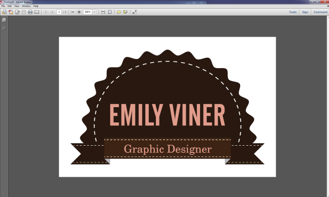
The stitch reminds me of sowing and the ribbon and rosette remind me of a gymkhana. My friend used to receive rosettes when she competed. However, I don’t think this means the design isn’t viable as rosettes symbolise winning and being the best. Ribbons are a popular trend in design at the moment.

What about typeface choice?

I have noticed a lot of use of condensed typefaces in the UK and in Switzerland. The two images I used for inspiration for the typeface both reminded my of condensed typefaces so that’s why I used it. I’m very keen to keep up with current trends.

What are the connotations of the type faces?

I used Century Becker Schoolbook and Alternate Gothic. Alternate Gothic is bold and simple. I wanted it to make an impact. Century Becker Schoolbook, as seen here has serifs and is quite classic and classy. I like the uppercase R which has a nice flick.

http://tinyurl.com/d6khc8y

How did your idea generation go?

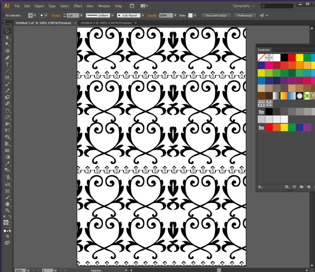
I tried to make a repeating pattern. I wanted to make a swatch. It was much harder than I had hoped. I spent a lot of time on this and it amounted to nothing which was frustrating.

Did you experiment? Have you learnt any new skills?

Yes I learnt how to take a piece of type, convert it into a vector and then repeat it along a path to make a repeating pattern. It looks very eye-catching and professional. Sadly I couldn’t place the pattern on the document as I wanted so I couldn’t get it to work.

Are you happy with the final piece?

Yes I like it although it might need some revision. My tutors may feel that the stitch is unnecessary and may recommend I delete it. I am not sure if they will like the rosette or not as some may think it looks a bit fussy. I did think that a brown circle with just the name in the centre would suffice although I’m not sure how memorable that would be. I’m using my card to show potential employers that I can make vectors so my card acts as an advert for me.

What skills do you need to improve on for the future?

I need to work out a way of using repeating patterns in my designs where they actually work. The main problem I had was that the swatch tiles either didn’t match up properly and there were gaps or the vectors hung off the side of the page and I couldn’t work out how to trim them.

How can you learn to make your repeat patterns successful?

A fellow class mate (Hannah J) has told me that I should try the step and repeat option in InDesign so I’m definitely going to try that. I have never heard of step and repeat in InDesign. Perhaps I had so many problems because I didn’t use this option.

Final pieces

I saw this small advert on the internet and I used it as inspiration.

http://www.dailymail.co.uk/tvshowbiz/index.html

I also used this as inspiration for typeface choice. I saw it on my friend’s blog, see his blog address under this image.

http://carddsgn.com/business-card-gallery/studio-graphik/

Identity – Research (Technical and Aesthetic)

Here is what I came up with for my first try using vectors.

Made the front part of the ribbon lighter to make it more 3D.

Here is my first attempt at the back of my business card design.

I found a vector on the internet to use for the address symbol.

http://www.bazaardesigns.com/5726-house-icon-set/

WordPress make a pdf available that contains a vector of the WordPress logo. I downloaded this and used in on the back of my business card.

Click to access wordpress-logo-notext-cmyk.pdf

I found a vector on the internet to use for the smart phone symbol.


http://www.danocreative.com/art-downloads/free-instant-messenger-sms-icon-set/

Here I have added the symbols and the stitch.

Here I tweaked the placement of the elements to try to get it perfect.

Here is the letterhead. I designed it like this because I found this was the best way to fit all the information on the page.

Here is my first attempt at a compliment slip.

Here I tweaked the placement of the elements to try to get it perfect. I don’t know if this is the perfect way to set the type so hopefully the tutor can let me know if I can improve it.

Making a repeating pattern for the back of my letter

I thought it would look nice to have a professional repeating pattern on the back of my letter. I have liked this image since I saw it months ago.

I got this sample from http://www.gfsmith.com/ who kindly came to my college and gave a presentation.
I tried to learn how to make a repeating pattern.

Here are some really pretty pieces of type that can be converted to paths and then used to make a beautiful repeating pattern.

http://www.dafont.com/soft-ornaments-four.font

I put two pieces of type on a circular path. I think it looks eye-catching.

Here I changed the colours as I thought the black and white was a bit jarring.

Here I tried to make a swatch tile but as you can see it doesn’t match up properly.

I tried again but as you can see I still can’t get it to match up properly.

As you can see, the pattern doesn’t quite match up perfectly.

Here I was frustrated again because as you can see on the right, the pattern doesn’t look tidy with a small piece left over.

Here I tried again but I couldn’t work out how to trim off the extra at the side. Very frustrating.

I’m still having problems making this work properly so I’m going to move on to another idea.

Inspiration for business card design

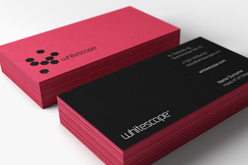
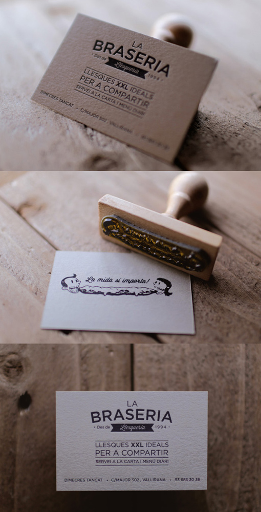
I found these designs and I think they’re eye-catching.

http://cardobserver.com/gallery/whitescape-corporate-card

I like the ribbon and the stamp.

http://cardobserver.com/gallery/business-card-for-la-braseria

I like the unusual shape.

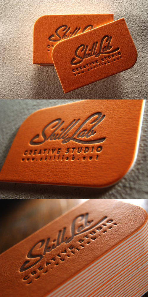
http://cardobserver.com/gallery/bold-orange-letterpress

Really clean and minimal.

http://cardobserver.com/gallery/cool-simple-letterpress

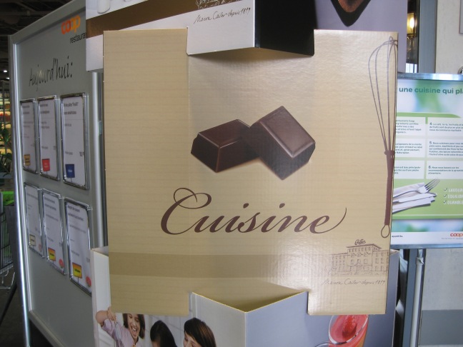
Cailler of Switzerland

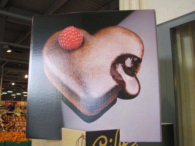
I saw this as I walked in to a supermarket in Switzerland. I really like the type and design, its really beautiful and looks delicious. This type looks like calligraphy and its quite ornate. I haven’t decided which typeface I’m going to use yet.

I think its clever how the designer made an apron using chocolate.

Here is the logo. Its curly and reminds me of melting chocolate.

http://www.cailler.ch/en/