Evaluation and reflection

What did you enjoy the least about photography?

The least enjoyable part was when the photographs came back from the photo shoot and a lot of them were blurred. I felt like a failure.

What did you enjoy the most about photography?

The best bit was working with the models, specifically the ones that really went the extra mile to give me exaggerated facial expressions. I found that when the model understood the idea and had a talent for acting it made a really great result.

What part of your research was the most interesting?

There was so much research for this project it is hard to say which is the most interesting. Learning about the meaning behind the posters and paintings we looked at was very interesting.

What part of your research was the least interesting?

I didn’t find any of it boring. It was just very time-consuming.

How do you feel you idea generation went?

I think this went well but some of the initial ideas turned out too tame for my liking.

How do you think your final piece turned out?

I’m glad the final idea turned out quite disturbing. I wanted people to remember it. I wanted people to wonder how this photo was created.

Did you do any experimentation during this project?

Yes a lot. Taking photographs with a professorial camera turned out to be an experiment. Using adjustments > Photo Filter was a total experiment which shows how useful taking a chance is.

How was your time keeping?

I finished the final piece way before the deadline which was great. I did not time the writing up of the project as well as I would have liked.

What have you learnt for the future?

  • I’ve learnt that I really enjoy retouching photographs. I will ask my tutors about careers in retouching.
  • I need a lot more practice with a professional camera.

What would you do differently next time?

I must remember how time-consuming the writing up part of the project is and I must leave more time for it. Next time I should use a camera I can actually work properly.

What skills do I need to develop for the future?

I need to practice using a professional camera. I would like to learn more retouching skills.

Final Idea: Embellishments – Body dysmorphic disorder (BDD) – Part Three (Final Part)

My model kindly agreed to another photo shoot so I could get some more pictures of this particular pose in the mirror.

I asked the model to touch her face.

Here she actually looks shocked.

I asked her to look horrified. I think she did a really good job.

This is the photo I decided to use for the final piece.

Here is the picture I took the wrinkles from.

http://www.morguefile.com/archive/display/159333

I tried making her jaw bigger as this is a common complaint.

I decided not to use the enlarged chin as it looked a bit blurred.

I decided to add a patch of acne. I tried a lot of different images.

I sent the image to the tutor for feedback. He said that the acne might be mistaken for a bruise or a burn. I agreed.

I deleted the acne and added a few moles instead. Here are most of the images I used/tried. This image also shows the images I used for the neck and décolleté.

I did a test print to see if the image was pixelated and to see if you could see the moles I had put on. The image was not pixelated. The moles were not dark enough. I wanted the viewer to be sure that the left side of her face in the mirror is not the same as in reality. This is the whole point of the piece.

I used copy and paste to move the wrinkles on to the face.

After pasting the layer on to the models face I used a really soft eraser brush to make the edges into a soft gradient instead of hard edges that wouldn’t blend well.

After that I used the eye dropper tool to find out the real colour of the models skin. I did this for each area on her face where the wrinkles would cover.

To make the wrinkles match the colour of the models face I used adjustments > photo filter. I tried this option totally by chance and I think this is the factor that has helped this piece to look so real.

I clicked on the pasted layers and I input the real colour of the models skin into the photo filter and set it at 100%. This made every layer I pasted the right colour to match the models real skin colour on every area of her face.

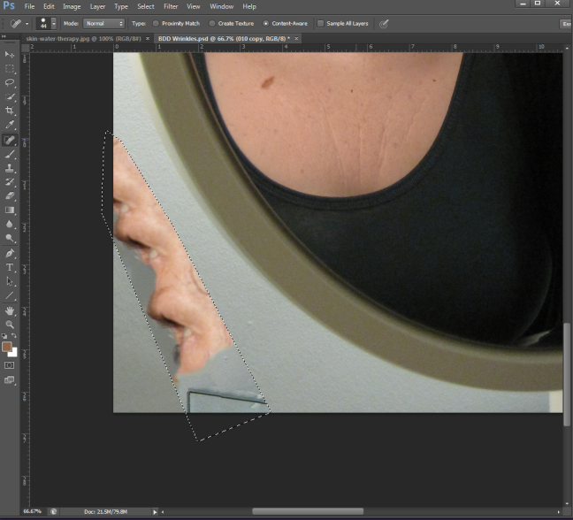
I decided to get rid of the wire using fill > content aware. It didn’t work well the first time as seen here but I did it again and it was fine. I also used the clone stamp tool to make sure all of the wire was gone.

Here I am putting on the text:

Here is the final idea:

I’m really proud of this as I think it’s quite disturbing. Here is what the image looks like without the photo base. This is quite a bizarre image on its own.

Halloween – Photoshop skills

My friend sent me her Halloween make-up picture. She asked what I thought of it. I emailed her back, giving her some advice on make-up application.


(Picture courtesy of Lucy Helm http://lucyhelm.wordpress.com/)

In the email I said ‘My advice would be to add black kohl eyeliner around the eyes (or any eyeliner you have) to give more definition. Also I wouldn’t apply dark shadow to your nose or chin. Use a white eye shadow on your cheek bones to highlight them. That’s what I’d do.’

I then thought why not try to show her using Photoshop.

I decided to change her left cheek as well.


In the end I used overlay as I realised I’d lost a lot of the skins texture by covering over it with colour.


I enjoy editing photographs. I think this has turned out ok. I still need to practice more and learn more.


Layer Tennis Activity

The tutor said today we are going to try Layer Tennis. No one knew what it was. The tutor explained that it means that one person changes the image and then passes it on to the next person. This website gives more information.

http://layertennis.com/

Here is the image the tutor gave us to begin with. Connor took this image and made some changes.

Here is Connor’s image:

Image courtesy of Connor Maynard.

He then sent the picture to me and I made some changes. I felt it was quite busy so I took quite a lot away. Here is my design.

I then sent the image to Alex and he made his changes. I really like what he did with it. The only problem is the text is difficult to read.

Image courtesy of Alex Greenhead. See his blog here: http://alexgreenhead.wordpress.com/

It was fun.

Glossary of terms – Timeline – Presentation

verisimilitude

ver·i·si·mil·i·tude
noun
1. the appearance or semblance of truth; likelihood; probability: The play lacked verisimilitude.
2. something, as an assertion, having merely the appearance of truth.

leitmotif

leit·mo·tif
noun
a motif or theme associated throughout a music drama with a particular person, situation, or idea.

acerbic

a·cer·bic
adjective
1. sour or astringent in taste: Lemon juice is acerbic.
2. harsh or severe, as of temper or expression: acerbic criticism.

prescient

pre·scient
adjective
having prescience, or knowledge of things or events before they exist or happen; having foresight: The prescient economist was one of the few to see the financial collapse coming.

chromo-lithographic

chro·mo·li·thog·ra·phy
noun
the process of lithographing in colors from a series of plates or stones.

triptych

trip·tych
noun
1. Fine Arts . a set of three panels or compartments side by side, bearing pictures, carvings, or the like.
2. a hinged, three-leaved tablet, written on, in ancient times, with a stylus.

altarpieces

al·tar·piece
noun
a painted or carved screen behind or above the altar or communion table in Christian churches; reredos.

Belle Epoque

belle é·poque
noun, plural belles é·poques
the period (1871–1914) between the end of the Franco-Prussian War and the outbreak of World War I, characterized by relative peacefulness in Western Europe and by marked advances and productivity in the arts, literature, technology, etc.

curvilinear

cur·vi·lin·e·ar
adjective
1. consisting of or bounded by curved lines: a curvilinear figure.
2. forming or moving in a curved line.
3. formed or characterized by curved lines.

Timeline

1864 – Toulouse-Lautrec born on 24 November 1864.

1881 – Magazine of Art

1889 – The Moulin Rouge opened in 1889.

1890s – In England, just as in other European countries, the public’s fascination with Art Nouveau posters peaked in the 1890s.

1890 – Cheret ‘was offered the highest award of the French state, membership in the Legion of Honor.’ ‘…Cheret’s recognition announced to Europe that the art of the poster had arrived.’

1894 – popular magazines also served a significant role in bringing new graphic art to the attention of the public. One of the most famous, Le Rire (“the laugh”) was a satirical journal with strong political views, established by Felix Juven in 1894.

1895 – Les Maitres de L’affiche (Masters of the Poster) magazine in France.

1898 – The Poster magazine in Britain. ‘…The Poster was established in London in order to promote the medium as a new art form. It is important to remember that graphic designers were still struggling for recognition as artists at this time.’

1898 – ‘Meier-Graefe continued to spread the gospel of Art Nouveau in Berlin, where he founded the influential journal Dekorative Kunst in 1898.’

1899 – Meier-Graefe ‘opened a gallery called La Maison Moderne…’

1901 – Toulouse-Lautrec died on 9 September 1901.

1910 – Das Plakat magazine in Germany.

1920 – Traditional absinthe was banned in most European countries by 1920.

Jane Avril (1899) – Presentation

This poster is significant as an example of Toulouse-Lautrec’s evolving style, especially when compared to earlier paintings of Jane Avril.

The snake wrapped around her is likely an invention of Lautrec’s, rather than a costume that Avril actually wore. Its twisting shape is indicative of the Art Noveau style — which accentuated fluid lines and curves — that was then replacing Japonisme as the dominant artistic trend.

Avril’s manager rejected the poster because he didn’t like the snake.

http://www.lautrec.info/posters.html

http://0.tqn.com/d/arthistory/1/0/s/a/nms_0208_hdtl_12.jpg

Ambassadeurs: Aristide Bruant dans son Cabaret (1892) – Presentation

This famous 1892 poster advertises Aristide Bruant’s debut at the Ambassadeurs, a much more upscale venue than his own club, Le Mirliton.

The manager of the Ambassadeurs hated the poster, and Bruant had to threaten to cancel his engagement unless it was used. The manager conceded, but Lautrec never did receive his fee.

http://www.lautrec.info/posters.html

Bruant befriended the artist in 1885. The poster portrays Bruant’s aggressive personality and stage-dominating charisma. Creating a complex flat pattern of planes that recede or push forward through colour, Lautrec again demonstrates his mastery of Japanese style.

Divan Japonais (1883) – Presentation

This poster was for the Montmartre cafe concert that opened in 1883 called the Divan Japonais. It shows the artist working under the Japanese print aesthetic. The flattened areas of even colour, prominent curvilinear black contour lines, and overall simplification are all elements that show a Japanese influence.

Here, Toulouse-Lautrec’s style matched the interior design of the club, which was an assemblage of Asian motifs.

In this poster, the artist represents two of his friends watching a performance of the singer Yvette Guilbert (1867-1944). Guilbert was an important part of the popular music scene. We see the art critic Edouard Dujardin (1861-1949), who had written persuasively on the aesthetic sophistication of Japanese art. He seems to be in the middle of making a point, while he is interrupted by the appearance of the singer on the stage in her signature long black gloves. The lady in black is Jane Avril, a dancer from the Moulin Rouge.

Many of the artists posters suggest a sense of ironic detachment  as the artist distanced himself from the spectacles that were an important part of his daily experience.

La Goulue at the Moulin Rouge (1898) – Presentation

‘Today we know Henri de Toulouse-Lautrec as the archetypal bohemian artist of the belle époque…’

http://www.lautrec.info/biography.html

Toulouse-Lautrec became a fixture at the Moulin Rouge. He spent his evenings drinking absinthe, sketching, and socialising with the rest of the clientele. He found comfort in the more marginal social whirl of Montmartre, where bourgeois men consorted with their mistresses and prostitutes.

He captured this atmosphere in posters such as La Goulue at the Moulin Rouge (1895), which shows the dancer and performer Louise Weber (1866-1929), who called herself La Goulue (“the Glutton”), because of her astonishing ability to consume alcohol.

She is pictured dancing with her partner Jacques Renaudin (1843-1907), whose rubbery joints had earned him the nickname “Valentin the Boneless”. Toulouse-Lautrec loved the way the pair looked mismatched.

Stylistically, this poster shows the artists expressive style, which is governed by his free-flowing line and decorative sense of colour. It is also significant for the technical sophistication of its printing; this was the first time a colour lithograph was created using four separate stones (black, red, yellow, and blue). This technique allowed Toulouse-Lautrec’s original design to be reproduced without losing any of its splendid colourist effects.

Moulin Rouge (“Red Mill”) – Presentation

‘Mass entertainment was transformed by venues like the Moulin Rouge, home of the Can Can…’

http://europeanhistory.about.com/od/france/a/belleepoque.htm

The Moulin Rouge opened in 1889 and is easily distinguished because it has a renovated windmill.

Picture from this book:

How it looks today:

http://tinyurl.com/92mhofs

Modern poster for the Moulin Rouge.

http://www.moulinrouge.fr/#/histoire/